Interaction design, Motion and haptics specs, Onboarding
Tools
Figma, Play, Principle
People want to cut through the noise in their inbox. Many of them come to Proton Mail from Gmail, where categories have long pre-sorted mail into tabs, and they expect the same.
Categories brings that to Proton Mail on all platforms, my work focused on designing this feature for iOS and Android. The inbox is sorted automatically into Primary, Social, Promotions, Newsletters, Transactions, Updates and Forums. Additionally the user is able to customize or disable the feature entirely.
The recordings on this page are captures of working prototypes, made at different points as the project progressed.
Categories sit as a row of labels at the top of the email list. Only one is active at a time. The row scrolls horizontally, and at rest the last visible label is cut off at the edge of the screen as a hint that there's more to scroll to. Reaching either end gives a gentle bounce.
A badge for what's new
Inactive categories show a small dot when new mail arrives in them. The dot isn't about whether messages are read, it's about whether you've seen that something new arrived. It disappears as soon as you open the category, even if the mail stays unread, and comes back only when something new lands.
Horizontal scroll
New-mail indicator
Categories on scroll
I did several iterations of the categories behaviour on scroll. First iterations explored how to collapse the pills to enable more focus on the email list. However, it made it more difficult for users to switch categories. So the final decision was to keep the default pills during scroll.
This behaviour was handed off for implementation on both iOS and Android.
Category collapses with progressive blur
Category collapses with a softer backdrop
Switching categories from the collapsed header
Handoff vertical scroll with categories
Unread, from top to bottom
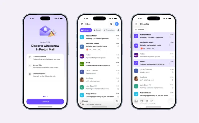
Categories needed the space under the header, and the unread filter already lived at the top. Keeping both there would have crowded the most important part of the screen, so the unread filter moved down to a floating button in the bottom left, which shifted the hierarchy of the whole screen.
Feeling native
Tapping it should feel native to iOS 26's Liquid Glass: the button expands with a quick, gentle spring to make room for a close icon, which rotates and scales into place, together with a light haptic tap. While on Material we went for a mixed FAB.
Various explorations of the unread behaviour
Onboarding
This feature was a big change for our users, so choosing the right introduction was important.
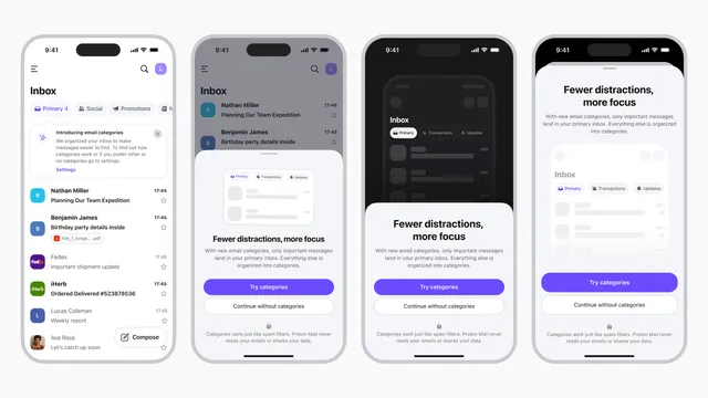
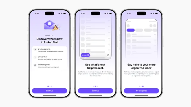
We treated consumer and business accounts differently. For consumers, Categories is on by default, and the onboarding leads with seeing what's new and skipping the rest. For business accounts, it's off by default: the same onboarding focuses on staying on top of new mail and lets people choose to try Categories or continue without them.
The user stays in control. Settings lets them turn Categories off, choose which categories to show, and set push notifications for each one.
I worked on several explorations between a subtle message and a full onboarding setup. During several reviews, it was clear that the full setup provided more clarity, less visual noise on the main screen and also helped present the new feature as a celebratory moment.
Onboarding explorationsHandoff onboarding flow
Measuring it, privately
To learn whether Categories was working, we tracked a few signals:
How many users choose to disable categories from onboarding or within settings.
Overall sentiment in social media.
Algorithm accuracy, tested with a group of beta users to improve the model.
After handoff
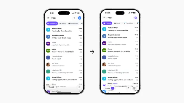
I handed off my designs to another designer, who carried the feature to launch while I moved to Proton Calendar. The shipped version changed a few things: the pills use Liquid Glass, scrolling pushes the top navigation, the new-mail dot sits next to the category icon, and the unread button shows a count.
Most of these changes are improvements. The dot, especially, feels more connected to its category. The count on the unread button feels noisy to me, though. I'd have kept it in the pill, so it's clear which category the count belongs to.